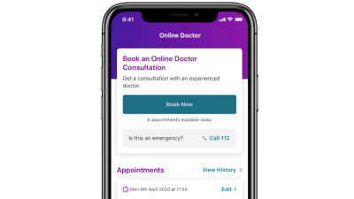

Redesigning the Vhi app dashboard for a better digital customer experience
-
UX and UI Design
Usability Testing
Rapid Prototyping
Leading Irish healthcare and insurance provider, Vhi asked us to redesign the dashboard of their core customer-facing app. The dashboard is the first touchpoint for customers and functions as the gateway to access all additional information and features. The data showed that users weren’t interacting with the dashboard in the way Vhi wanted them to, with many features going unnoticed, or unused.
We set out to redesign it in a way that would help people complete the task they set out to do and offer a strong first impression and experience for the user. We also wanted to create an opportunity to engage with customers in new ways through highlighting features they may not yet be aware of and integrating carefully selected promotional content.
The solution created was simple, personal, and functional with an improved visual design. 90% of users preferred the new dashboard design describing the aesthetics, colour, layout and ‘feel’ of the interface positively, and the functionality as easier to use. Conducting early-stage user research provided direction and efficiencies — the design was aligned with user needs and we avoided investing time and effort into creating features that were deemed unnecessary by Vhi customers.
Outcomes
-
New dashboard preferred by 90% of app users.
-
Improved user experience and usability (13% increase in SUS test scores)
-
Design and development time and resource efficiencies through user research insight
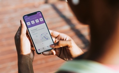
Working with Vhi Healthcare
Our client, Vhi Healthcare, is one of the most well-known and established insurance providers in the Irish healthcare market, having been operational since 1957 and with over 50% market share.
In recent years, they’ve turned their attention to making sure their key digital products — their app, and website — are effective, engaging and aligned with the needs and changing demographics of their customers. We came on board as their key design partner, focusing primarily on optimising their multifaceted app.
Understanding the current problems with the dashboard through data analysis and user research
Phase 1: Data analysis and observations
We exported customer data gathered over a 1 year period across both iOS and Android devices, showing the number of successful logins as well as the usage data around 12 specific app features.
The data showed that many features simply weren’t being used by Vhi customers, who tended to navigate only to a few common sections such as Online Doctor, Parkrun or ‘Snap and Send’. This meant that many of Vhi’s services were being underutilised by customers who may benefit from them.
The design of the app was also overcrowded and lacked consistency, with lots of individual elements that had been designed separately and didn’t work well together.
Phase 2: User interviews
We also conducted user research to enable us to create a dashboard that was truly based on user insight, with findings categorised into needs, wants and pain points. User interviews help us to better understand the ‘why’ behind the analytical findings.
The primary need for all users was to be able to complete a specific task — they initially downloaded the app when they had a task to complete and were often unaware of other features. Pain points were centred around the need to re-enter information causing frustration, not knowing certain features existed or understanding how to use them, and too much space being dedicated to features that are irrelevant for them.
Creating early concepts and seeking feedback from stakeholders and users
After our research and initial design exploration, we came up with 3 distinct concepts that aligned with business and customer goals.
Before showcasing the concepts to users, we held a Q&A session with Vhi’s app stakeholders to find out what they thought of the concepts from a business perspective, and to make sure our goals and objectives were aligned. This was also the chance to make sure our UX was feasible for the Vhi development team.
When each stakeholder voted on their concept of choice and shared their thoughts, Concept B was the clear winner, with the team loving its quick access to tasks, personal notifications, and bold promotional area.
We then conducted a round of low-fi concept testing with Vhi app users to understand what features and ideas worked well with returning users. We discovered that users wanted to see activity history and all documentation in one place, and that a minimal and clean layout was important. This feedback would help us move forward with a user-centred solution.
Avoiding wasted efforts by gaining deeper user understanding: Personal, not personalised
This early concept testing was particularly insightful around the topic of personalisation. The Vhi team had been planning on rolling out new functionality to allow users to build their own custom dashboard, fine-tuning exactly which tiles and features they wanted to see.
Speaking to real users highlighted that this level of personalisation was not required. Whilst users agree that personal data is what makes the app feel personal, they see the content as being set by Vhi and don’t want to waste time setting up the customised homepage themselves. A friendly tone of voice, along with their individual policy number and name, would be enough. This insight saved a significant amount of time and budget on complex design and development work.
Putting insights into action
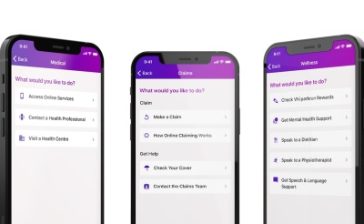
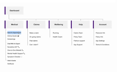
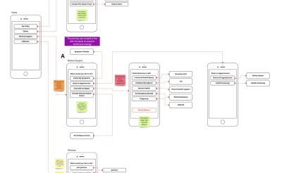
Based on our learnings from this phase of user testing and client feedback, we moved forward with the final dashboard concept, looking at areas in finer detail and ensuring every scenario had been considered.
The end result was a clear, uncluttered layout that was packed with useful features. It was friendly and personal, yet primarily functional and task-based. It also included spaces to subtly promote benefits and new features.
After launch, a final round of usability testing and interviews were conducted with Vhi app users, which revealed the positive impact of the new dashboard, as well as helping us to further build our understanding of Vhi customers’ needs, pain points and behaviours to inform future projects.
The new dashboard is preferred by 9 in 10 users
- 1 90% of users preferred the new dashboard style describing the aesthetics, colour and ‘feel’ of the interface positively, along with the fact that features of interest were laid out in one place.
- 2 Users perceived the new dashboard to be easier to use than the old one and were able to quickly find services, features and support
- 3 83% of users had a positive perception of the Vhi app, liking the simple, clean design, easy access to features, and ability to complete tasks quickly
- 4 Great user feedback and reviews for the Vhi app — Apple app store rating of 4.7 and Google Play rating of 4.6
- 5 Average System Usability (SUS) scores increased 13% for old vs. new designs
And ongoing, we work together with the Vhi team to measure performance and look for ways to continually optimise the customer experience.
Looking to optimise your app, website or other digital tool?

You might also be interested in...

Enhancing the CPD experience for HCPs with a new e-learning app

eBusiness Implementation Manager, Vhi Healthcare