- Mobile UX & UI Design
- CX Strategy
- User Research
- Usability Testing
Designing the next generation of digital healthcare and insurance

Outcomes
- Winner of 'Best App' at the Digital Media Awards
- Achieved company goal of becoming #1 Healthcare app in Apple App Store, Ireland
- 48% increase in monthly active app users year-on-year
How we created value
For 4 years, we've partnered with Ireland’s largest healthcare and insurance provider, Vhi, to help them revitalise their core customer-facing app.
The Vhi app provides access to their entire proposition. With a future focus on wellness and healthy lifestyle incentives, it integrates features of policy benefits, expert access and additional support services.
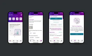
Working through a three-step process of insight gathering, concept testing and action, we’ve designed and launched many new features — a mobile-first design system; ‘Online Doctor’, online physio and dietitian telehealth services; a unique Women’s Health feature; a ‘Snap & Send’ claims tool; a new app dashboard; a Symptom Checker and more.
By adopting a truly customer-centric approach to design and development, we’ve created a best-in-market digital customer experience for 100k+ monthly app users and empowered Vhi members to take control of their health through seamless access to services.

A customer-centric design process based on first-hand insight and testing
At the core of our shared design philosophy is the focus on customers. Research and first-hand insight are prioritised, meaning every design decision is driven by a deep understanding of needs, preferences, and pain points.
To ensure consistency and efficiency across the app, we have developed a bespoke design system for Vhi. This living library of visual styles, principles, and components acts as the backbone of the app's design. By leveraging this system, we deliver a familiar and intuitive digital experience for customers, and reduce development costs and complexities.
Our design process involves using different research methods to define and understand the user experience and any pain points occurring around a certain feature. This includes desk research, competitor analysis, and first-hand customer interviews. Findings are collated and incorporated into our concept designs.
Next, we create clickable prototypes — a quick and easy way to realise concepts, with interactivity that emulates real user journeys. We test scenarios with customers at this stage, to identify issues or opportunities and avoid wasting effort on the development of unsuitable concepts. All feedback is actioned and designs are finessed before the final version is developed and launched.
When a feature has launched, we look at live engagement data and conduct regular rounds of additional user testing to identify ways to iteratively improve and keep delivering for our customers.
Feature deep dive: 'Snap and Send'
When conducting user testing for Vhi's ‘Snap and Send’ feature — a digital claims processing tool — insights revealed that the old design was not intuitive for users. The process of uploading receipts and entering information was clunky, and the number of treatment types (a drop-down list of 60+) was overwhelming. We also learned that users disliked the lack of updates on next steps after submitting a claim.
We conducted a moderated ‘tree test’ with customers to understand what categorisation would work best, and built these into the new designs. Additionally introducing status updates to keep users informed and reassured about the progress of their claims.
The improved Snap and Send app feature increased monthly claims from 66k to 90k in the 3 months post-launch, an overall usage increase of 35% YOY. We receive regular positive feedback from Google Play and App Store users about the ease of use of the Vhi app.
User feedback:
- Super easy, especially using the Snap and Send for reimbursement. *****
- VHI app is easy to navigate and provides all the necessary prompts. Well done VHI. *****
- Easy to use App. Smart functionality and nice features. *****

A focus on user experience drives increased customer engagement
By focusing on user experience and insight-driven design we’ve been able to transform the Vhi app and improve engagement with features that allow members to lead more healthy and active lives. Some of the recent results we’re most proud of include:
- 1 Monthly unique active app users increased by +48% last year, representing an average increase of 31k users per month.
- 2 The number of Snap and Send claims processed via the app increased by +35% to a staggering 74k average claims per month.
- 3 We’ve achieved an Apple app store rating of 4.7, with many positive reviews referencing the ease of use of the Vhi app.
- 4 Despite increasing competition in the healthcare insurance sector, Vhi Healthcare continues to have the largest market share amongst competitors.
The trust that underpins the relationship between Vhi and Graphite has been built from repeated success when it comes to outcomes, enabling universal faith in our process.
Through speaking to customers, creating prototypes, testing, then repeating a process of refinements and customer feedback on an ongoing basis, customer engagement has drastically improved.


