Simple ways to improve your website’s accessibility

- Accessibility
Ideally, a website should be built – from its very inception – with accessibility at the bedrock of its foundations. Accessibility is not something that should be bolted on later to tick a checkbox. It’s vital that the internet, and use of websites are accessible to everyone to provide equal opportunities for all.
That said, it is possible to enhance existing user journeys to improve accessibility for websites that are already functioning. In this article, we will review some of the enhancements that can be made to make it easier for your website to be accessed by all.
The internet is increasingly becoming an essential part of everyone’s lives and use of it allows many people to operate and function in their daily activities whether at work or at home. The internet can affect education, employment, health, leisure time and more. An accessible website can help disabled people feel more engaged in society, and can be used by people with a diverse range of hearing, movement, sight, and cognitive abilities. As product owners, web designers and web developers, we have a responsibility to ensure that websites are accessible to a wide range of customers. Creating inclusive experiences is about having empathy for others, and putting users first should be at the centre of what we do. Some customers navigate websites with their keyboard or with a screen reader; some are colour-blind, and some partially-sighted. Others may be deaf or hard of hearing or have limited motor skills. Read on to discover who is leading the way in accessibility as well as some key ways to improve your current website.
Some companies are establishing extra initiatives to ensure that design is inclusive and accessible by all. Sightsavers are running an ongoing initiative called Perspectives which promotes the importance of accessibility in design and communications. The team at Sightsavers often host social inclusion workshops to help promote inclusive design.
1. Add a ‘Skip to content’ link
Purpose
‘Skip navigation’ or ’skip to content’ links provide a way for screen readers and keyboard users to quickly jump over site navigation to the main content. This function is vital when a site has a large navigation system, like a mega menu, before the main content. (Otherwise, it involves some serious tabbing!)
How they work
The skip link is a simple hyperlink, and it should be the first element on the page. It is usually invisible until the user has focused on it. When the link is triggered, the browser will take the user to the main content area.
How we do it
On our site, the skip link is invisible until the user has focused on it. Upon doing so, the link is revealed in the top-left of the page with a bold background to draw the user’s attention.

2. Keyboard Navigation
Set link and form input focus styles
Purpose
Adding focus styles to hyperlinks and form inputs helps users that rely on keyboard navigation to browse your website.
To test your site focus styles, load up your website, and hit the TAB key on your keyboard. Eventually, after tapping the key, you should be able to focus on some links on your webpage. If you can’t see where your focus is, it’s a good sign that you need to add some focus styles.
How they work
By default, when you use your keyboard to navigate to a link, the browser displays an outline around it. This is the browser’s way of letting the user know that they have reached a link and that it’s clickable. For example, Google Chrome shows a shadowy blue outline around the link and Firefox uses a dotted border. If you make the decision to remove the default browser outline, you should replace it with your own CSS focus style. The focus should be obvious to the user, so they don’t miss it when scanning the page.
How we do it
We don’t add any extra CSS focus styles; we use the default browser outline. Below, you can see the blue outline on Google Chrome. The blue is a clear contrast to the coral text and the white background making it hard to miss.

The gov.co.uk website is a great example of a website conforming to accessibility standards for tabbing. Users are able to navigate through the links on the page, including the search box using the keyboard. Users are also able to go through the pages links in the correct order. The tab that the user is currently on is yellow to clearly differentiate the link selected from the other links on the website. It also won the ‘Design of the Year’ award, described by Design Museum director Deyan Sudjic as “the Paul Smith of websites. It makes life better for millions of people”.

3. Use HTML5 tags and Aria Landmarks
Purpose
HTML5 introduced semantic markers that designate sections of the page as header, navigation, main content, and footer. This task is one to raise with a developer, as they can add these landmarks to the HTML templates.
How they work
Landmarks do not replace skip links. Screen readers can use landmarks to navigate from section to section.
Use <header> for your site header, <main> to contain your main content, <nav> for navigation, and <aside> for any other content that is related to the page (like a sidebar or advert).
4. Add transcripts and captions to videos
Video transcripts are required by W3 (World Wide Web Consortium) for videos with sound and help to provide basic video accessibility. It can be as simple as typing the transcript up yourself or asking someone to help out. There is no requirement to include timestamps in the transcript.

If you embed Vimeo videos on your site, you can set closed captions in the Vimeo admin panel. Youtube provides automatic captioning or you can add your own subtitles. W3C - the web standards body - deems captioning as ‘nice to have’ on videos but required on audio-only recordings.
5. Colour selection and contrast
In order to meet accessibility laws, websites need to use colours that make all content of the site visible and readable and also with an appropriate contrast. Depending on their type of visual impairment, users may find it easier to use websites in low or high contrast colours. According to UXDesign.cc; the standard for colour contrast is a 4.5:1 ratio between foreground (i.e. text, images) and background. The Colorable site is a great way to test if the colours of your website fail or pass accessibility standards. The Contrast Ratio tool is also useful for testing.
The Sky Accessibility website does this well as it provides a ‘Change site colours’ bar in the top right of the website’s header so that users can adapt the website for their visual needs.

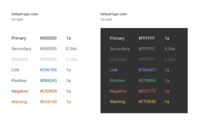
Google Chrome has been developed with a focus on colour contrasts. As you can see in the image below, every colour of text passes the contrast test for the background colour they are on.

Ways to test accessibility
- Browser Plugins (Chrome)
-
SiteImprove Accessibility Checker. Actively updated. 49,000 users and 4.5 star rating.
-
Chrome WAVE evaluation tool. WAVE is a web accessibility evaluation tool developed by WebAIM.org. 150,000 users and 4 star rating.
These plugins provide an overview of your website’s accessibility issues, explain how these issues affect your users, and offer suggestions on how to fix them.
2. Use Default software screen readers
Visit your website using a screen reader to identify areas for improvement. You can use Narrator for Windows machines, and VoiceOver for Mac.
3. Test with real users
It’s even better — if you have the time and resources — to observe frequent users of screen readers completing tasks on your website. They may be experienced with the technology, and will display true tried-and-tested approaches that a first-time screen reader may not have considered. For example, they may use keyboard shortcuts to complete simple tasks.

